
Social Templates
Visual Design
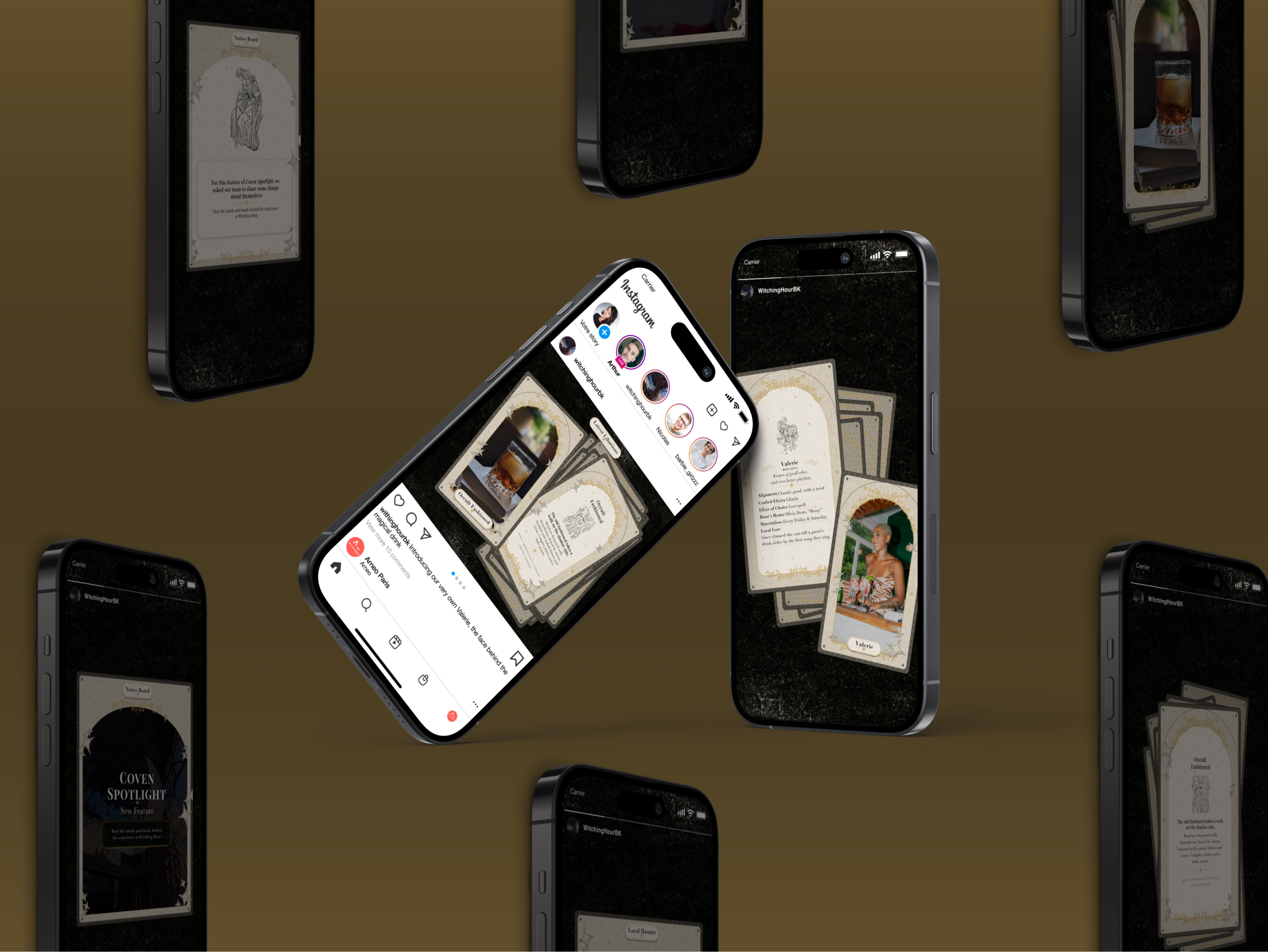
Role: Visual Designer
Timeline: 3-4 weeks
Project Type: Social Media Design System
01 Overview
Witching Hour, a local Brooklyn bar with a cult following — dim lights, velvet shadows, tarot cards tucked behind the counter, and cocktails that feel like tiny rituals.
But their social feed didn’t match the atmosphere.
The stakeholders, wanted to elevate their social presence but lacked a cohesive brand identity or design system. Their posts were visually inconsistent, disconnected from the moody in-person experience making it difficult to build recognition or communicate their unique aesthetic.
They needed a visual identity for social that felt as enchanting as the bar itself.
So I aimed to design a flexible suite of modular social templates that established a consistent brand look and made it easy for the team to produce high-quality content quickly.
The social template system was developed over a 3–4 week period, which included visual exploration, iteration across multiple template variations, and refinement of the final style direction.

02 The Problem
No defined brand system.
No repeatable visual patterns.
No templates for staff to use day-to-day.
The result: the brand’s personality was getting lost online.
My goal was to build a system that captured the bar’s dark, mystical energy and made it effortless for the team to post consistently.
03 crafting the visual world
To build the foundation, I studied the bar’s in-person vibe and pulled inspiration from:
- textures
- tarot iconography
- deep shadows + grain
- celestial accents
- moody color palettes
- serif typography with personality
This phase was about translating ambience into design language.

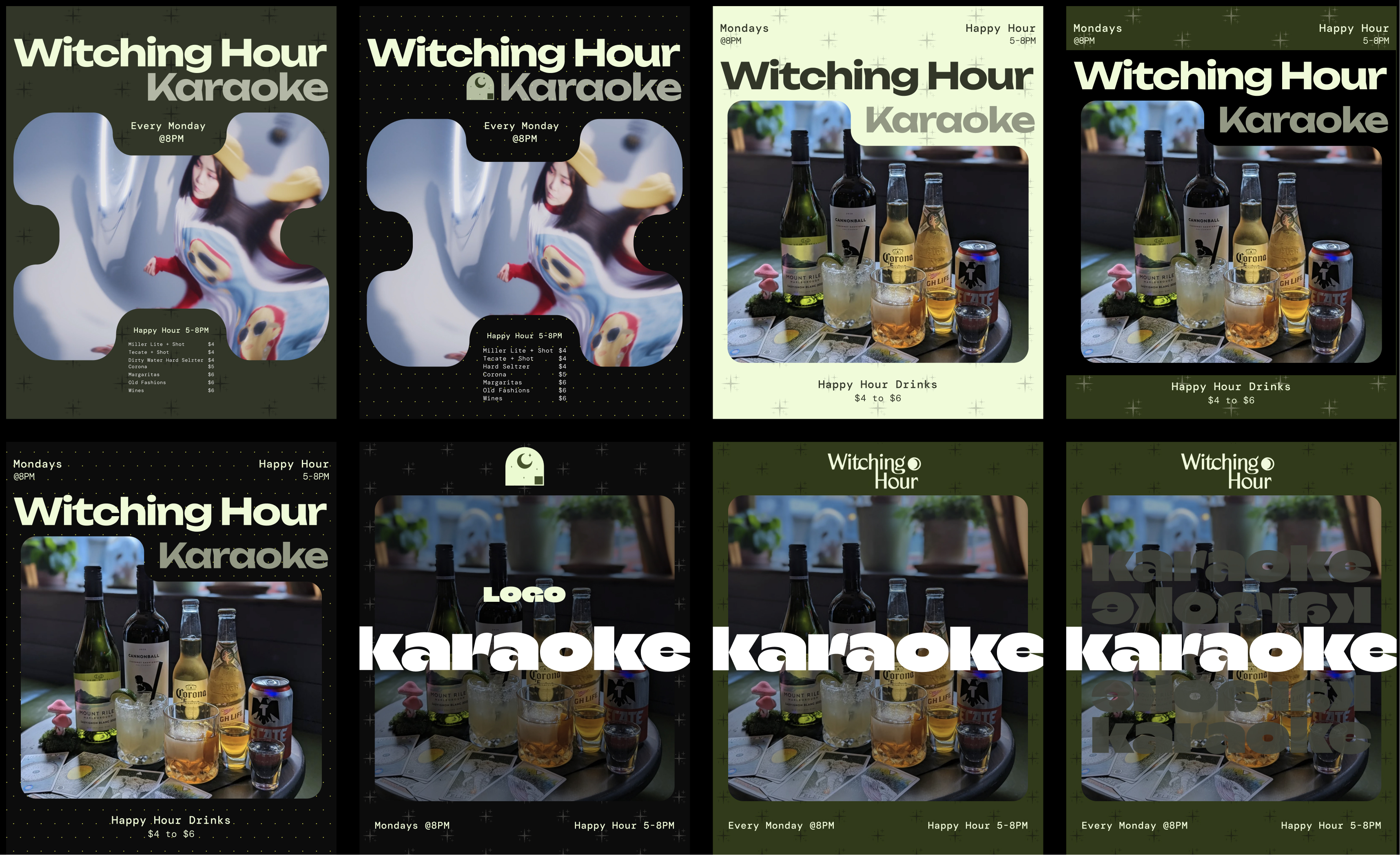
Here are some examples of the Initial explorations I've done taking inspiration from the previous designs, they leaned very heavily towards more generic bar/social media aesthetics. But, after much consideration they ultimately didn’t capture the bar’s mystical, intimate character. By iterating from those early designs, I refined the visual direction to reflect Witching Hour’s unique atmosphere while still remaining flexible for it's social content.
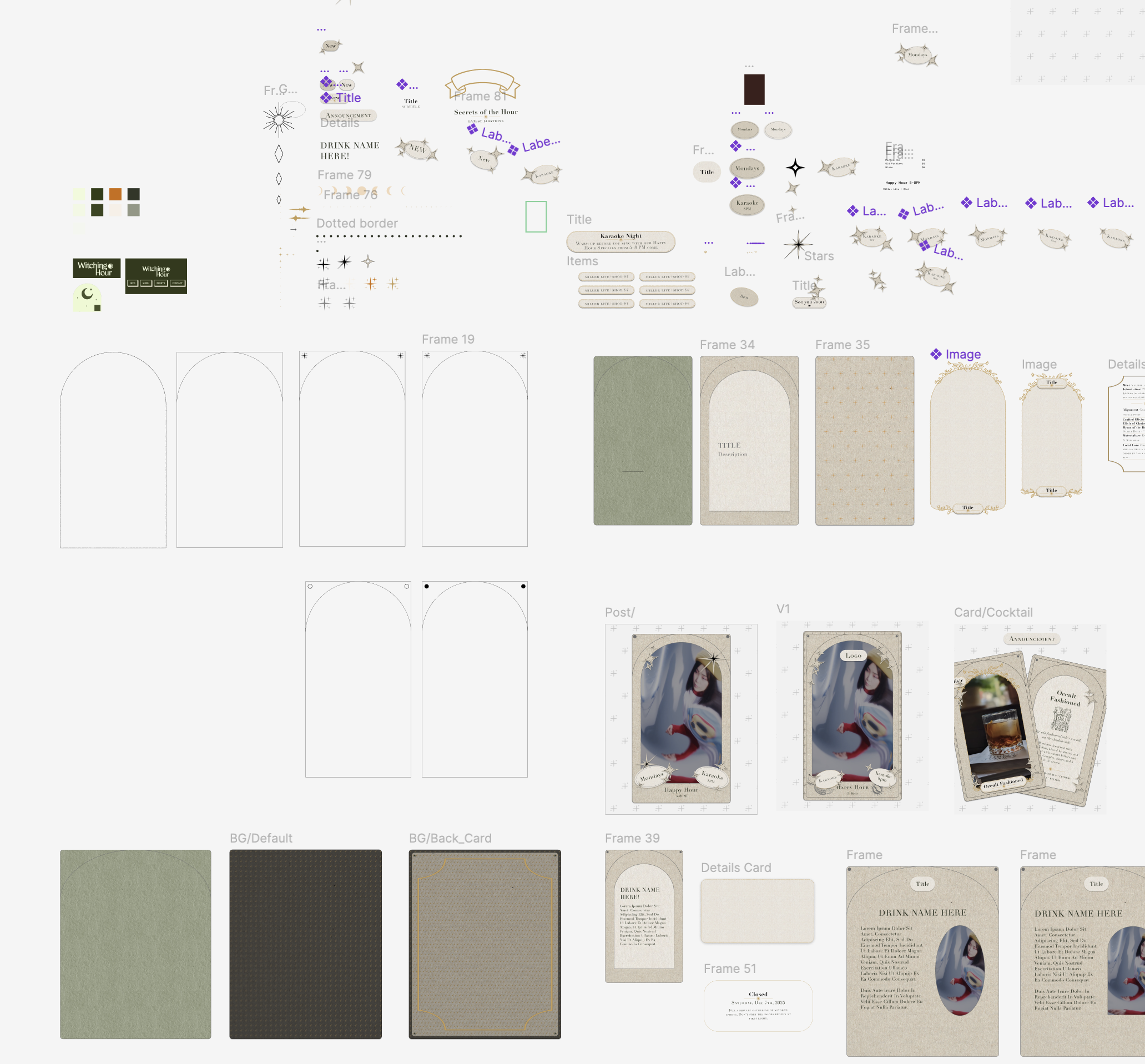
As I narrowed down this direction of the designs I continued to explore the mystical elements that I could incorporate into overall designs.
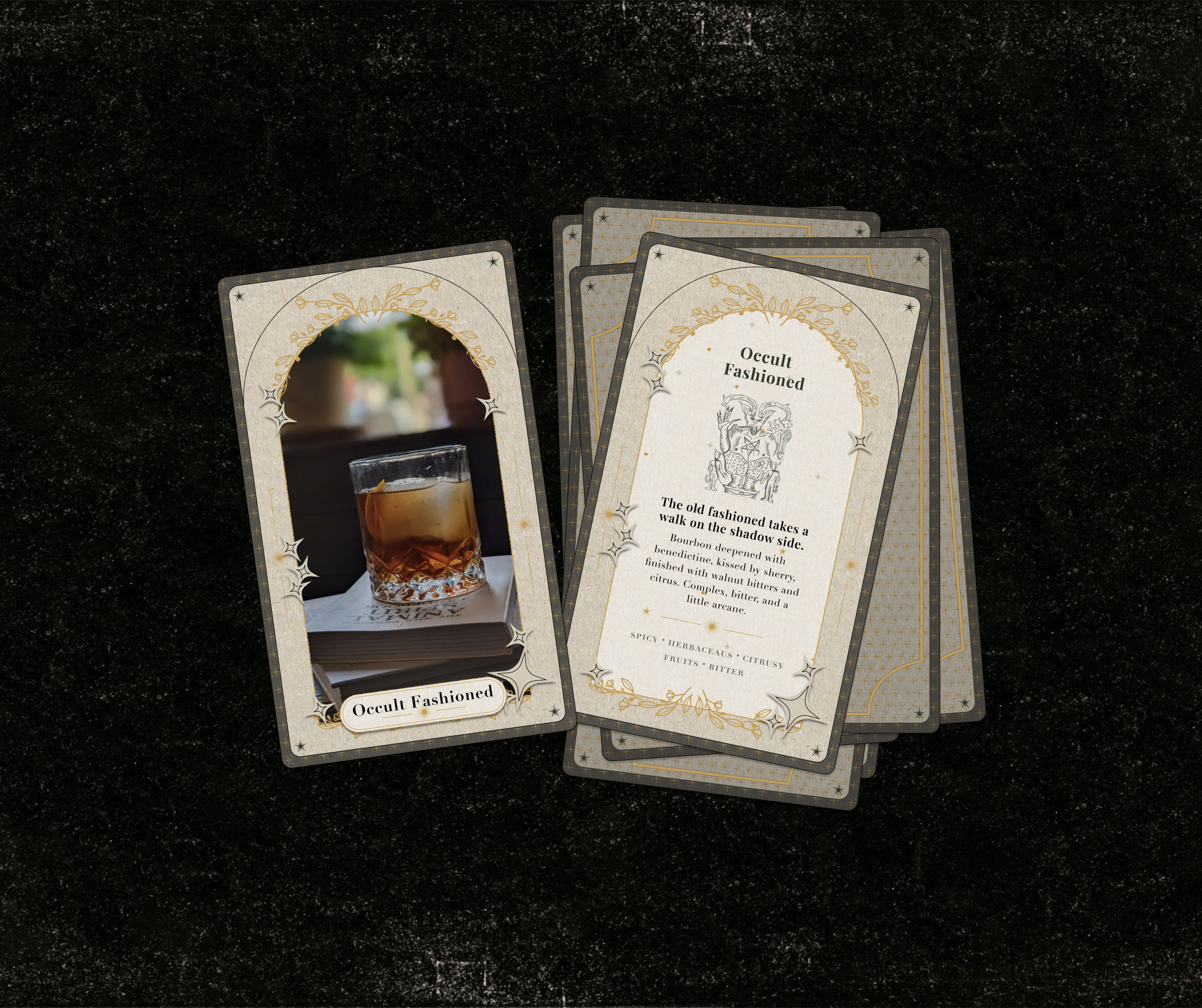
Such as maintaining the tarot card layout, while using “frames” or ornate borders that echo the other layouts, including small celestial motifs (stars, crescent moons, eyes, rays).
With a neutral palette with gold or cream accents and a small portrait or candid photo could go in an arch frame, that could be slightly softened.
The finalized design direction tone: mystical, elegant, and understated so it should be appear less corporate and more lore-inspired.
Deep exploration of the visual direction, testing diverse color palettes, form variations, playful shapes and layout structures. This phase was focused on pushing the boundaries of the concept to uncover the most cohesive and compelling design approach.
Both bold and minimal aesthetics, evaluating how different visual elements impacted hierarchy, usability, and overall mood. I iterated through numerous layout variations balancing typography, spacing, and visual weight to better understand which combinations communicated the concept with the most clarity and impact.
04 Building the Modular System
I created a flexible suite of social templates designed around interchangeable and modular parts:
Typography blocks
- Image overlays (grain, gradients, shadows)
- Mystical accents (lines, symbols, frames)
These modules can be rearranged to support many content types across the Social Templates:
- Event Announcements
- Weekly Specials & Cocktail Features
- Menu Highlights
- Staff Features / Introductions
- Storytelling Posts (editorial stories, lore-inspired quotes)
- Atmospheric “vibe” posts

05 Key Design Elements
Typography
I used Didot and Playfair Display to bring elegance and refinement to the templates. Their high-contrast strokes and classic serif forms complement the bar’s dark, mystical atmosphere while maintaining readability and hierarchy across posts.
Color & Visual System
This color palette is extended along with background images of paper grains in Black. Black serves as the primary background across all templates. The beige and gold accents balance the textured backgrounds and are used primarily for decorative elements such as florals, dividers, and subtle graphic details.
Text hierarchy is reinforced with black as the default color for primary text, and grey for secondary or less emphasized text on lighter backgrounds. This approach creates visual contrast while maintaining a cohesive, mystical, and elegant aesthetic across all templates.
Texture & Imagery
Grain, soft glows, shadow gradients, and high-contrast photography to create mood.
Graphic Accents
Minimal but intentional: arcs, thin line-work, symbols that hint at ritual and mystique.
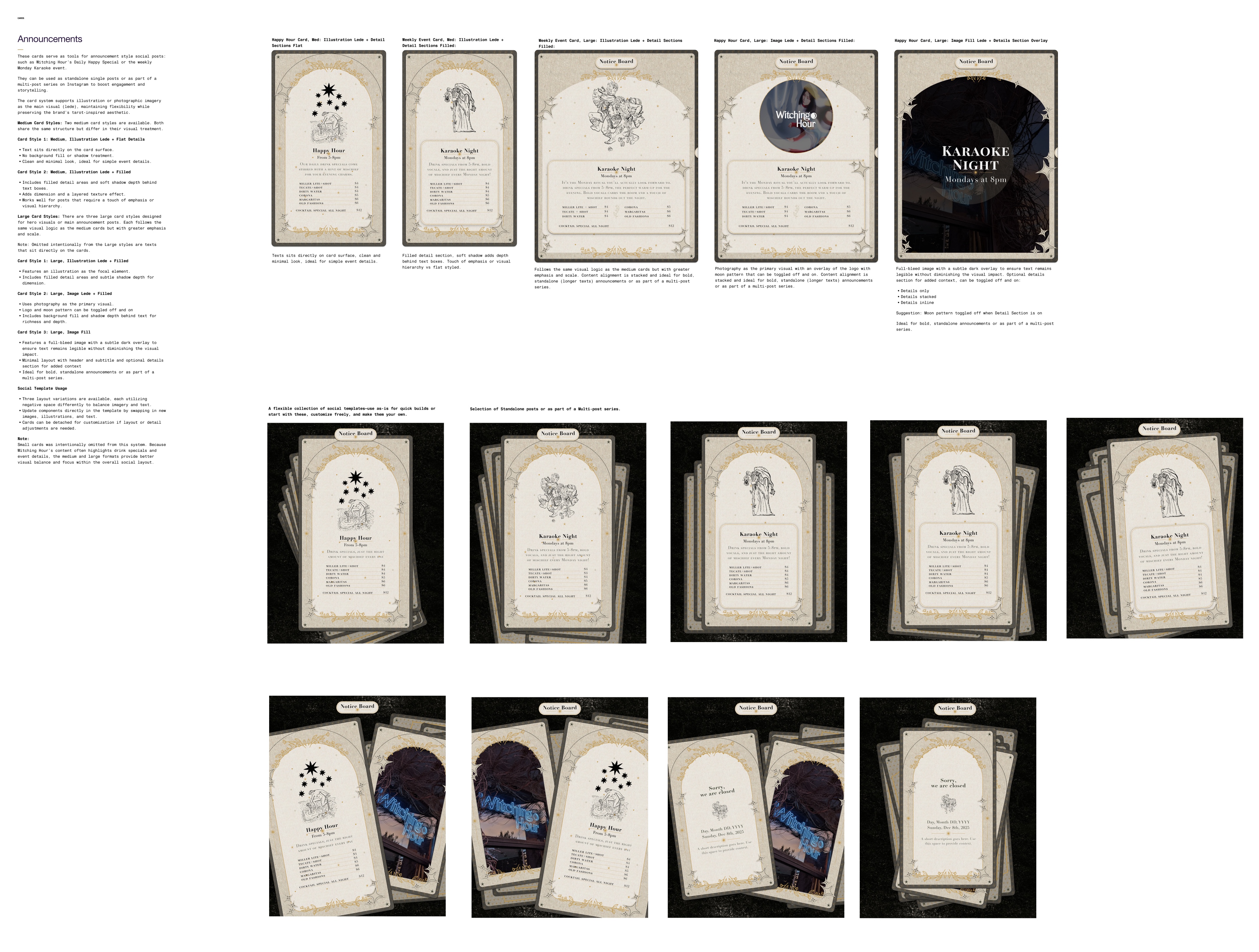
Snapshot of the visual style guide, illustrating designs in typography hierarchy, border treatments, illustration line styles, and layout structures. These variations helped define a consistent visual system that could scale across different event types and announcements.
06 Final System & Implementation
The final deliverable is a cohesive, plug-and-play design system the team can use without design expertise.
Posts now look instantly recognizable, on-brand, and visually unified.
07 — Impact
✨ Stronger brand recognition
✨ Faster social content creation
✨ A clean, consistent visual identity
✨ A feed that reflects the bar’s atmospheric, mystical experience

Additonal Design Mockups
Drinks & Menu Features
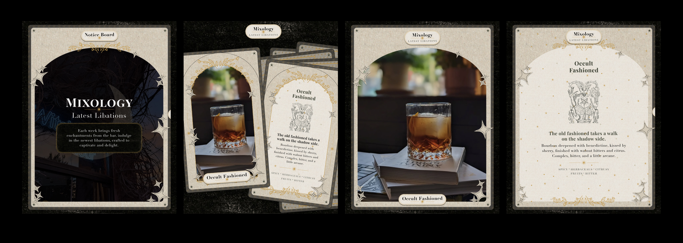
Templates for drinks and menu highlights were designed to feel immersive and luxurious. Key design considerations included:
- Full-bleed photography of cocktails or menu items layered with gradient overlays or shadow overlays
- Beige and gold accent patterns for decorative details
- Clear hierarchy for text: white texts for main info, secondary details with background fill serves as a content block
These stories let the bar showcase their products in a way that feels elevated, visually cohesive, and instantly recognizable.
Single Post Announcements
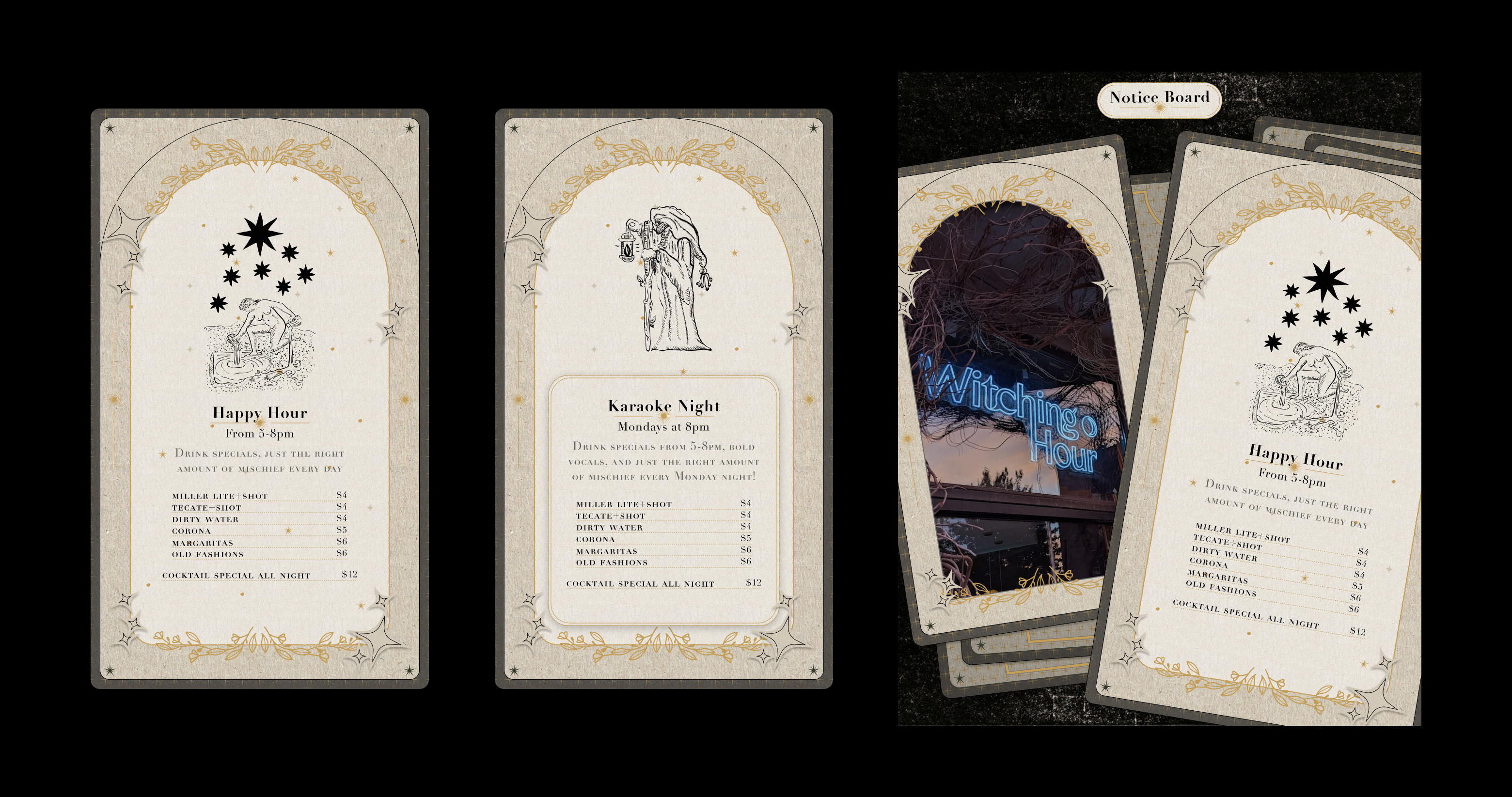
For announcements like events or special promotions, the templates were built to be flexible and attention-grabbing:
- Modular layouts for quick swapping of text, images, and decorative accents
- Bold headers paired with atmospheric imagery
- Accent elements used sparingly to draw attention without overwhelming the content
The objective was to make posts easy to create while maintaining a premium, branded aesthetic aligned with Witching Hour’s dark, mystical vibe.
The mockups below demonstrate how the templates can be adapted for different purposes, from single post announcements to engaging Stories, ensuring each piece feels on-brand and visually cohesive.

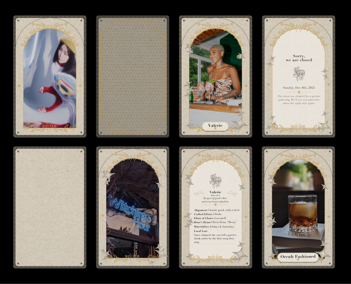
Staff Spotlights
These templates were designed to showcase team members in a way that reflects the bar’s mystical, intimate atmosphere. Using modular layouts, I incorporated:
- Portrait or lifestyle photos
- Accent elements like gold dividers, florals, or linework to add a magical, editorial feel
- Typography hierarchy with Didot/Playfair Display to maintain elegance and readability
The goal was to humanize the brand, highlight staff personalities, and keep the look consistent with Witching Hour’s overall visual identity.

08 — Reflection
This project was an opportunity to translate Witching Hour’s in-person atmosphere into a cohesive digital identity. The bar has a distinctive, immersive aura from dim candlelit interiors and velvet textures to tarot-inspired details and the challenge was to capture that essence while creating a system the team could use independently. The process required sensitivity to the brand’s mood, thoughtful iteration, and structured modular design.
Typography, texture, and modular components were central to establishing hierarchy, balance, and flexibility. High-contrast serifs like Didot and Playfair Display added elegance and sophistication, while a carefully curated color palette of black, beige, and gold accented textured backgrounds and decorative elements. Modular layouts allowed for everything from staff spotlights and menu highlights to event promotions and atmospheric storytelling posts — all consistent, visually engaging, and true to the brand’s mystical identity.
Ultimately, the system empowered the team to produce content efficiently, gave Witching Hour a unified digital presence, and translated their unique, in-person vibe into a compelling, on-brand social experience that resonates with their audience.
A heartfelt thank you to the team at Witching Hour Bar for trusting me to bring their social media presence to life. Your passion for creating a unique, immersive experience made this project inspiring and enjoyable, and it was a pleasure translating the bar’s distinctive atmosphere into a cohesive, flexible design system.
Role: Visual Designer
Timeline: 2025
Project Type: Social Media Design System